
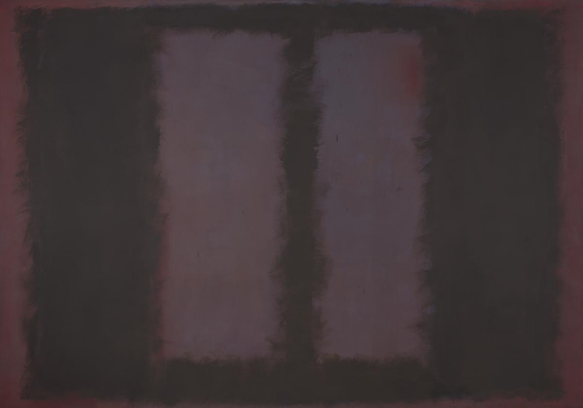
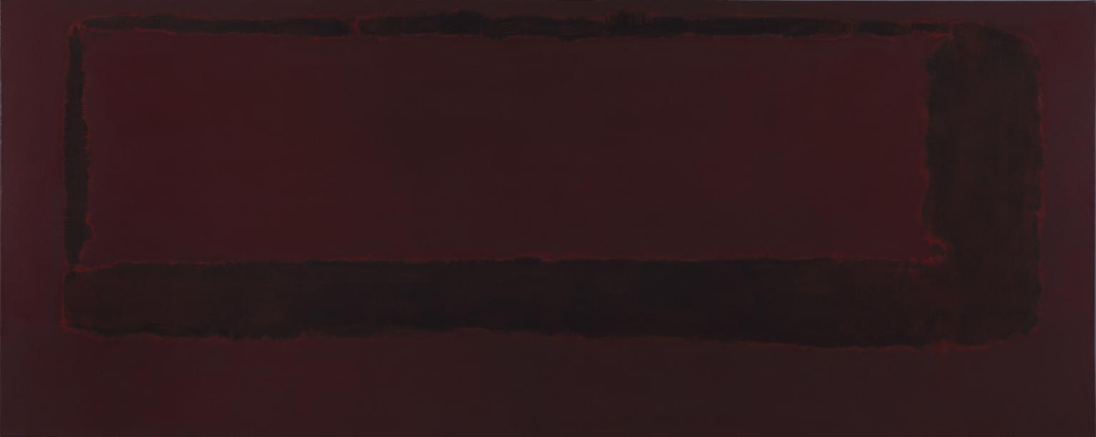
Mark Rothko, Black on Maroon 1958. Tate. © Kate Rothko Prizel and Christopher Rothko/DACS 2025.
11 rooms in In the Studio
The large-scale paintings in the neighbouring room – known as the Seagram Murals – were designed to immerse audiences
In 1958, Mark Rothko was commissioned to produce a series of works for a restaurant in New York’s Seagram Building. He constructed a scaffold in his studio to match the site’s dimensions, allowing him to paint at scale. He said that his paintings, ‘are involved with the scale of human feelings, the human drama, as much of it as I can express’.
The resulting works were much darker in mood than Rothko’s previous paintings. The bright and intense colours of his earlier canvases shifted to maroon, dark red and black. He described them as ‘more sombre than anything I’ve tried before’.
In 1960, after more than two years of work on the project and with a studio of completed paintings, Rothko withdrew from the commission. He felt the exclusive environment of the restaurant was an inappropriate setting for his artworks. He later presented a selection of nine canvases from the series to Tate.
‘This kind of design may look simple,’ Rothko remarked about his paintings, ‘but it usually takes me many hours to get the proportions and colours just right. Everything has to lock together. I guess I am pretty much a plumber at heart.’
Mark Rothko, Black on Maroon 1958
This is one of a series of large paintings Rothko made for a fashionable New York restaurant. By layering the paint, he created subtle relationships between the muted colours. They are much darker in mood than his previous works. He was influenced by the atmosphere of a library designed by the Italian artist Michelangelo (1475–1564). Rothko recalled the feeling of being ‘trapped in a room where all the doors and windows are bricked up’. A restaurant, he decided, was the wrong setting for these paintings. Instead, he presented the series to Tate gallery.
Gallery label, June 2020
1/9
artworks in Mark Rothko
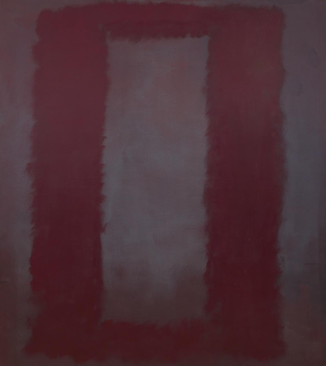
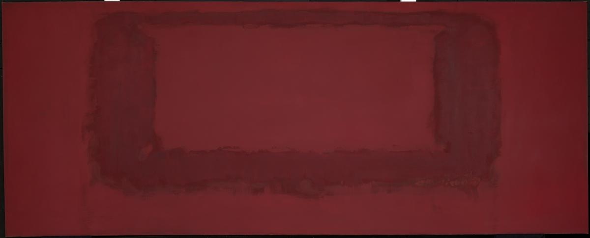
Mark Rothko, Red on Maroon 1959
This is one of a series of large paintings Rothko made for a fashionable New York restaurant. By layering the paint, he created subtle relationships between the muted colours. They are much darker in mood than his previous works. He was influenced by the atmosphere of a library designed by the Italian artist Michelangelo (1475–1564). Rothko recalled the feeling of being ‘trapped in a room where all the doors and windows are bricked up’. A restaurant, he decided, was the wrong setting for these paintings. Instead, he presented the series to Tate gallery.
Gallery label, June 2020
2/9
artworks in Mark Rothko
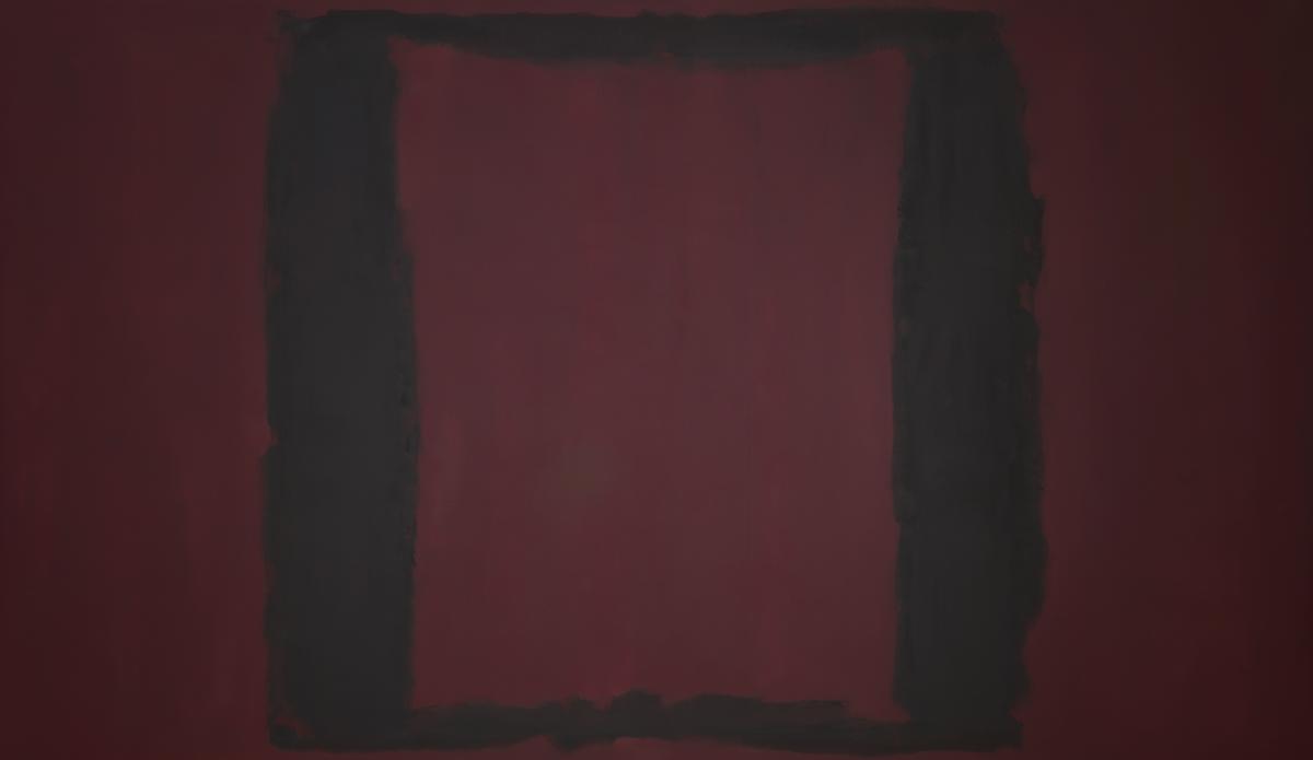
Mark Rothko, Black on Maroon 1958
This is one of a series of large paintings Rothko made for a fashionable New York restaurant. By layering the paint, he created subtle relationships between the muted colours. They are much darker in mood than his previous works. He was influenced by the atmosphere of a library designed by the Italian artist Michelangelo (1475–1564). Rothko recalled the feeling of being ‘trapped in a room where all the doors and windows are bricked up’. A restaurant, he decided, was the wrong setting for these paintings. Instead, he presented the series to Tate gallery.
Gallery label, June 2020
3/9
artworks in Mark Rothko

Mark Rothko, Red on Maroon 1959
This is one of a series of large paintings Rothko made for a fashionable New York restaurant. By layering the paint, he created subtle relationships between the muted colours. They are much darker in mood than his previous works. He was influenced by the atmosphere of a library designed by the Italian artist Michelangelo (1475–1564). Rothko recalled the feeling of being ‘trapped in a room where all the doors and windows are bricked up’. A restaurant, he decided, was the wrong setting for these paintings. Instead, he presented the series to Tate gallery.
Gallery label, June 2020
4/9
artworks in Mark Rothko
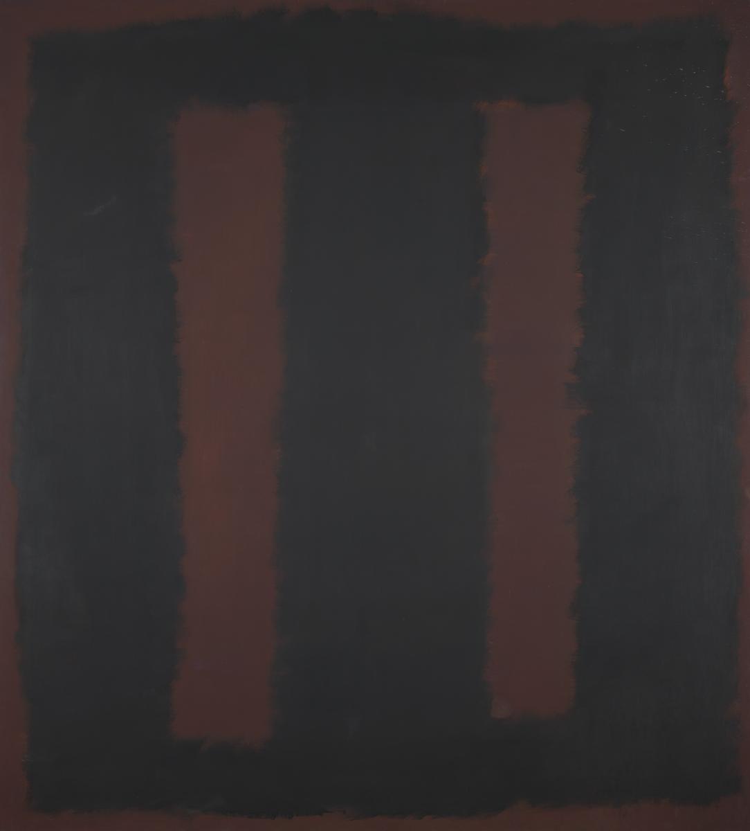
Mark Rothko, Black on Maroon 1958
This is one of a series of large paintings Rothko made for a fashionable New York restaurant. By layering the paint, he created subtle relationships between the muted colours. They are much darker in mood than his previous works. He was influenced by the atmosphere of a library designed by the Italian artist Michelangelo (1475–1564). Rothko recalled the feeling of being ‘trapped in a room where all the doors and windows are bricked up’. A restaurant, he decided, was the wrong setting for these paintings. Instead, he presented the series to Tate gallery.
Gallery label, June 2020
5/9
artworks in Mark Rothko
Mark Rothko, Red on Maroon 1959
This is one of a series of large paintings Rothko made for a fashionable New York restaurant. By layering the paint, he created subtle relationships between the muted colours. They are much darker in mood than his previous works. He was influenced by the atmosphere of a library designed by the Italian artist Michelangelo (1475–1564). Rothko recalled the feeling of being ‘trapped in a room where all the doors and windows are bricked up’. A restaurant, he decided, was the wrong setting for these paintings. Instead, he presented the series to Tate gallery.
Gallery label, June 2020
6/9
artworks in Mark Rothko
Mark Rothko, Red on Maroon 1959
This is one of a series of large paintings Rothko made for a fashionable New York restaurant. By layering the paint, he created subtle relationships between the muted colours. They are much darker in mood than his previous works. He was influenced by the atmosphere of a library designed by the Italian artist Michelangelo (1475–1564). Rothko recalled the feeling of being ‘trapped in a room where all the doors and windows are bricked up’. A restaurant, he decided, was the wrong setting for these paintings. Instead, he presented the series to Tate gallery.
Gallery label, June 2020
7/9
artworks in Mark Rothko
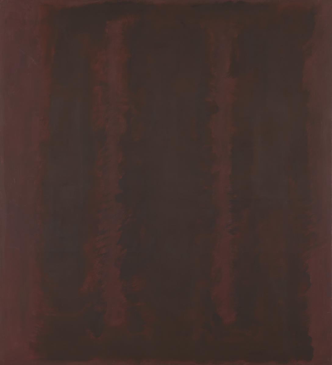
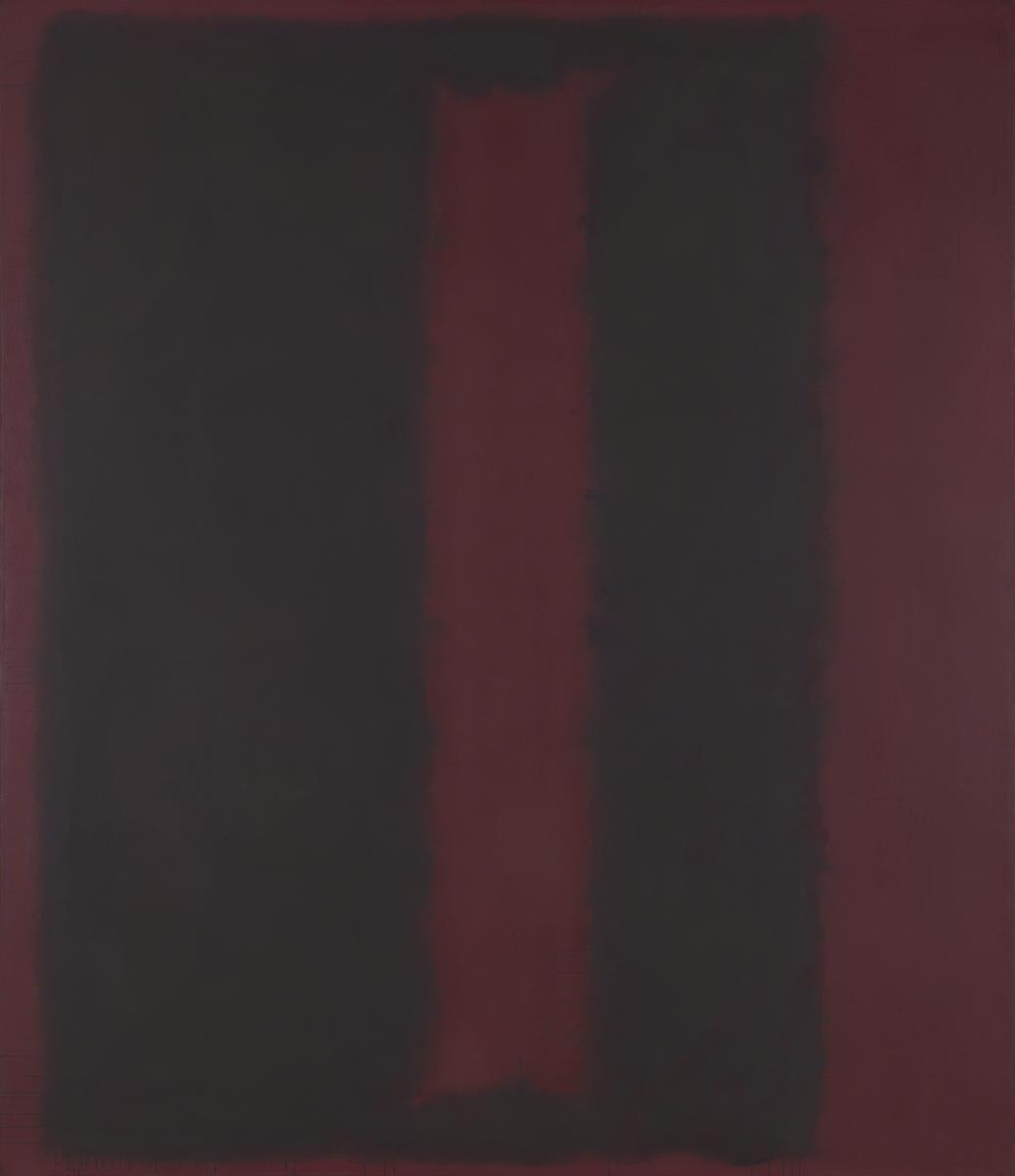
Mark Rothko, Black on Maroon 1959
This is one of a series of large paintings Rothko made for a fashionable New York restaurant. By layering the paint, he created subtle relationships between the muted colours. They are much darker in mood than his previous works. He was influenced by the atmosphere of a library designed by the Italian artist Michelangelo (1475–1564). Rothko recalled the feeling of being ‘trapped in a room where all the doors and windows are bricked up’. A restaurant, he decided, was the wrong setting for these paintings. Instead, he presented the series to Tate gallery.
Gallery label, June 2020
8/9
artworks in Mark Rothko
Mark Rothko, Black on Maroon 1959
This is one of a series of large paintings Rothko made for a fashionable New York restaurant. By layering the paint, he created subtle relationships between the muted colours. They are much darker in mood than his previous works. He was influenced by the atmosphere of a library designed by the Italian artist Michelangelo (1475–1564). Rothko recalled the feeling of being ‘trapped in a room where all the doors and windows are bricked up’. A restaurant, he decided, was the wrong setting for these paintings. Instead, he presented the series to Tate gallery.
Gallery label, June 2020
9/9
artworks in Mark Rothko
Art in this room
Mark Rothko
Black on Maroon
1958
Mark Rothko
Red on Maroon
1959
Mark Rothko
Black on Maroon
1958
Mark Rothko
Red on Maroon
1959
Mark Rothko
Black on Maroon
1958
Mark Rothko
Red on Maroon
1959
You've viewed 6/9 artworks
You've viewed 9/9 artworks